

Mollie Vickers
Playful, minimalist illustrations with a big heart.
Mollie uses bold lines and a (mainly) black-and-white palette to blend nostalgia with modern flair, capturing moments of lighthearted wonder and everyday magic
Can you introduce the piece and outline your process for creating it?
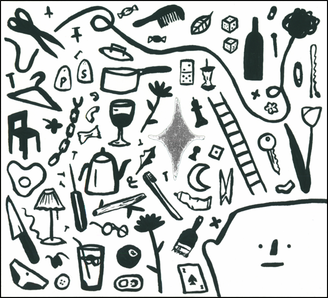
I wanted my artwork to reflect the feeling of coming across a sparkly new idea amongst the chaos of everyday life.
This was the first time using silver foiling within one of my illustrations! I really love the effect and definitely will be using it again.
How did it feel to be confined to an 11cm x 10cm box?
I actually really enjoy working within a certain size ratio as it helps me concentrate on how to build the space effectively.
Has this made you more interested in wine label design? Most of them are awful!
I actually think that the labelling that is seen on alcoholic beverages is one of the more exciting graphic languages used in everyday life. I think when you walk down the wine and drinks aisle, you’re more likely to come across interesting designs on labels as people are trying to stand out more as the product itself tends to be fairly standard in shape and size. I think especially within the craft beer sector there are a lot of interesting designs and illustrations to be seen.
When is the perfect moment to drink your wine?
I’m really enjoy cooking with wine (I’m not a massive wine drinker personally) but if I’m cooking with wine , I’d use a red in a spag bol or a bourguignon stew, or white in an Italian sausage and broccoli pasta dish that my boyfriend taught me!
