
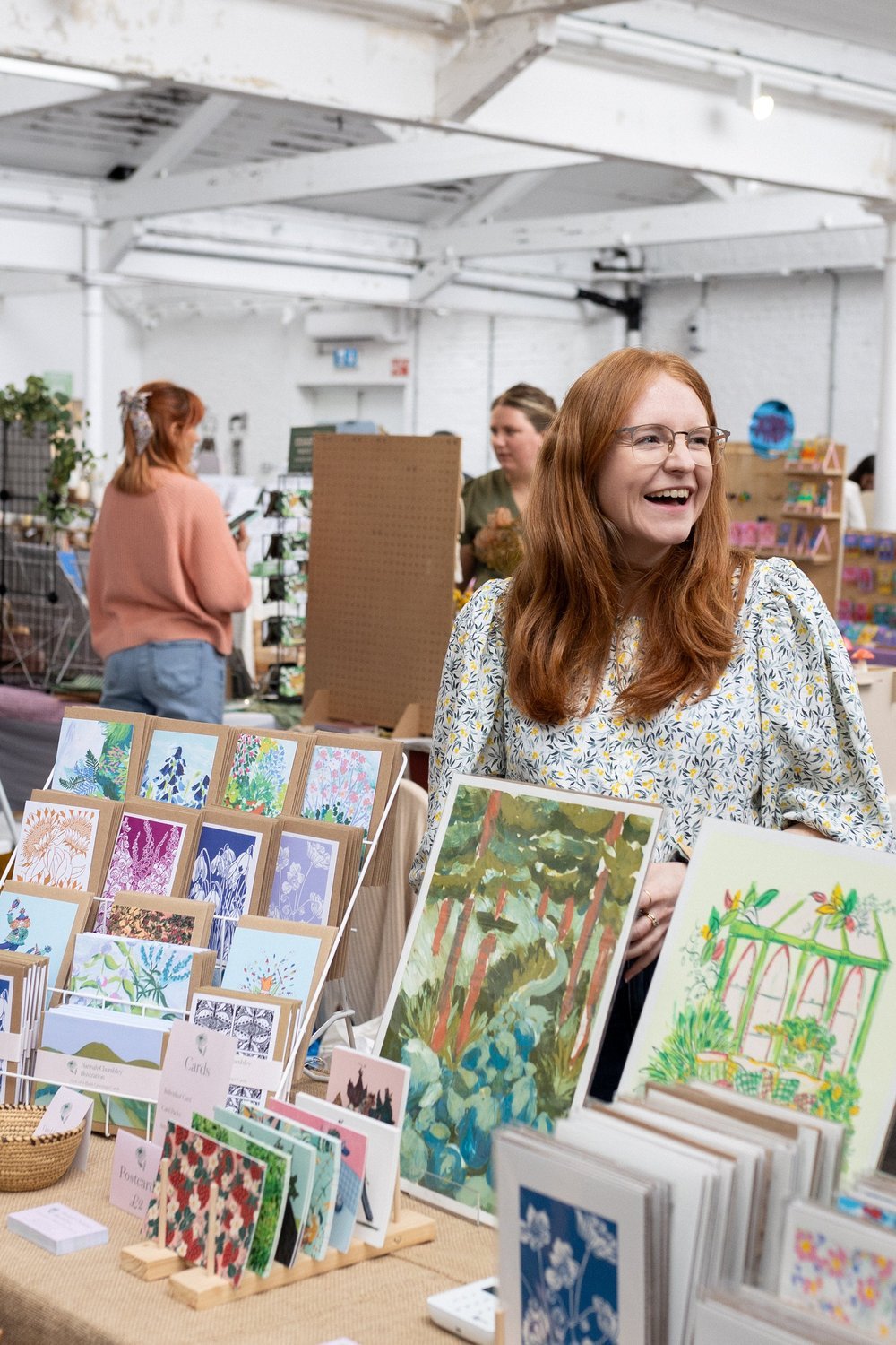
Hannah Chumbley
Shropshire printmaker celebrating nature!
Do you have a few lines to introduce yourself and your style?
I'm Hannah Chumbley, a printmaker based in Shrewsbury, Shropshire. My creative process usually starts with drawing on location in my sketchbook—getting out in nature and sketching what I see. I'm really inspired by the natural world so am usually drawing plants, landscapes, and areas of calm. From there, I use my sketchbooks to explore ideas that eventually become expressive monotype screen prints. I love the process of monotype screen printing and how the ink blends together through the screen. There is always a slight sense of the unknown about the process which is slightly addictive!

Can you introduce the piece and outline your process for creating it?
My piece is a peephole into a fresh, vibrant environment bursting with natural forms, slightly on the wild side. Inspired by the descriptive words on original bottle label.
Glass in hand, I firstly played around with my favourite Caran d’Ache Neocolour pastels to create different colour combinations and work out a palette for the piece that I felt represented the wine.
Whenever I can, I love to start a project by taking a sketchbook out drawing. This project was no different. I wanted to explore the tropical, fresh theme so went on a sketching adventure to Birmingham botanical gardens, where I spent a lovely day in the glasshouses drawing different foliage. Really getting a feel for how the different shapes and layers of plants all come together. No plan at the time, purely just having fun creating observational drawings, keeping the initial words in mind.
Back at home I played with the forms a little more and planned some loose thumbnail compositions. Then it’s time to get printing! I like to have a plan for my prints, pulling different elements from my sketchbooks but the prints do develop organically. Some designs I think look great on paper might not translate wonderfully to a print. I really find joy in the process of mono screen printing and sometimes do multiple versions of the same idea, tweaking elements until I’m happy.
For my wine label I found that I wanted it to look a little wilder than the initial prints so added more foliage in the backgrounds and altered the colour combinations until I was happy.

Did the wine itself—its flavour, story, or current label—influence your artwork?
It did! I read the description on the back and picked out a few words which stood out to me and used these as a starting point for my artwork. Vibrant, tropical, bright, and fresh, were the words I chose. I then played with colours that I thought paired well with these.
How did it feel to be confined to an 11cm x 10cm box?
I really enjoyed the challenge of working smaller. Recently I’ve been getting larger and larger with my prints so to begin with I thought, oh my goodness! How am I going to add all the detail I want into a smaller area?! In the end I loved being able to create lots of different prints and variations relatively quickly. I ultimately let the process of screen printing and the freedom of an open brief guide the final design from my initial sketches.
I did have a brief look in the supermarkets at existing wine labels but quickly realised most were a bit boring and that wasn’t the place to start this project! This is my first label design project and I’d love to do more! Bring on the swishy print strokes.
When is the perfect moment to drink your wine?
After a swim, a walk, or a day in the garden. Find a corner in your garden (in the evening sun preferably!), take a moment to enjoy your surroundings and have a sip!
You can find out more about Hannah and her work on https://www.hannahchumbley.co.uk/